SmartPhone usage in Australia
A study by Google has shown that by the end of 2011 50% of Australians will own a SmartPhone (be it an iPhone, Android or Windows 7 Phone). One of the most common uses for SmartPhone is researching businesses on the internet in order to call the business, get information or make online purchases. People are on their phones, anywhere and any time which means they could be looking for your website on their SmartPhone after seeing an advertisement, whilst in a store looking at your products or perhaps when discussing your product when out with friends.
How does your website look on a SmartPhone?
If your website has not been optimised for mobile viewing then it will probably need a whole lot of pinching and zooming to get in close enough to read. Without optimising the entire website will shrink to fit, making the text and images tiny and buttons hard to press. Users can zoom in but this can become cumbersome.
Another issue is the use of Flash in a website. Good news is it will work on your Android phone, bad news is Flash does not work on iPhones or iPads.
How can I get my website to work on a mobile phone?
You have two main options here – a responsive layout or a separate mobile only site (commonly know as an m-site). Each have their own set of advantages. Lets explain the two options:
M-sites
An m-site is a separate version of your website, often a cut down version of with specific information that targets mobile users. It uses a simplified design and is often stored in its own directory or sub domain – for example www.mydomain.com/m or m.mydomain.com. When users access any page in your website they get redirected to the mobile version. Users can choose to then exit the mobile site if they wish to get more information from the full site.
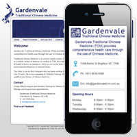
Example m-site
The Gardenvale TCM uses an m-site to provide visitors with quick and easy access the address, contact details, and hours of operation. Mobile phones are automatically redirected to the mobile site but can choose to exit to the full site if they need more information. Check out www.gardenvaletcm.com.au on your mobile phone or go directly to the mobile site.
Responsive Layouts
Instead of making a separate mobile site, this solutions takes your existing website and modifies the design to allow it to dynamically respond to the size of the user’s device (e.g. desktop computer, iPad, SmartPhone etc). No matter what device someone visits the website on or which page they visit, everyone will get the same content, the difference is the information is rearranged and resized for optimal viewing on their device. There is one website for all users.
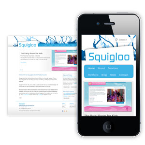
Example Responsive Site
The new Squigloo site uses a responsive layout. Resize your browser or view on a mobile device and watch how the content dynamically resizes. You can also check out the Profiler Recruitment Blog for another example of responsive design.
M-sites vs Responsive Layouts
The advantage of an m-site is you are tailoring the m-site content to the specific needs of mobile viewers. If your website design is quite complicated then an m-site also allows you to have a simplified and quick to load layout. The disadvantage of an m-site can be that you either have to double up on information or not provide all the content from your site to the user. Whereas with a responsive layout you are only dealing with one website for all users, with all the information accessible.
Which should I use?
M-sites are great for businesses who need to quickly provide there contact details and perhaps a couple of other pages for mobile users. Whereas a responsive design is great for website which people do a lot reading or research, for example blogs, or in site where users can do online shopping.
Talk to Squigloo today about making your website mobile friendly!


