Here are simple CSS tips and tricks for styling your forms.
The Form
Here is a our basic form. I’ve used labels in the form not just for accessibility but also to allow styling with CSS. Here is our form markup. Check out Specifying keyboard type for web forms on mobile devices post for info on the using HTML5 mobile attributes.
<form id="form1" name="form1" method="post" action="">
<label for="email">Name:</label><input name="name" id="name" type="text" /><br />
<label for="email">Email:</label><input name="email" id="email" type="email" /><br />
<label for="email">Phone:</label><input name="phone" id="phone" type="tel" /><br />
<input name="submit" type="button" value="Submit" />
</form>
Without any CSS this is how it looks:

Basic Styling

Lets add some basic CSS to align our labels to the left of our input fields and use some CSS3 to round the corners.
label {
    width:60px;
    float:left;
    font-size:12px;
    line-height:24px;
    font-weight:bold;

}
input {
    width:300px;
    margin-bottom:5px;
    line-height:18px;
    padding:2px 5px;
    -webkit-border-radius: 5px;
    -moz-border-radius: 5px;
    border-radius: 5px;
    border:1px solid #CCC;
}
Styling by field types

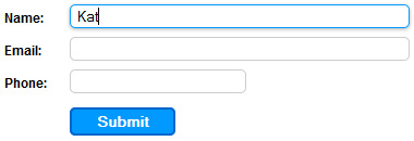
It’s looking better but as you will see the submit button is using the same styles as the other input fields. By specifying the input type via input[type=text] in your CSS to can specify the style for each input type. Also, as we used HTML5 form attributes we can also have different styles for each type of field.
/*General rules*/
#form3 input {
    line-height:18px;
}
/*Text, email & tel input fields*/
#form3 input[type=text],
#form3 input[type=email],
#form3 input[type=tel] {
    width:300px;
    margin-bottom:8px;
    padding:2px 5px;
    -webkit-border-radius: 5px;
    -moz-border-radius: 5px;
    border-radius: 5px;
    border:1px solid #CCC;
}
/*Just the tel field*/
#form3 input[type=tel] {
    width:150px;
}
/*The Submit Button */
#form3 input[type=button] {
    margin-top:5px;
    margin-left:60px;
    padding:2px 20px;
    -webkit-border-radius: 5px;
    -moz-border-radius: 5px;
    border-radius: 5px;
    border:2px solid #06C;
    background-color:#09F;
    color:#fff;
    font-weight:bold;
}
Styling on Focus

Lets add some user feedback. When they select a field (it comes into focus) we want it to change appearance. To do this we use the input:focus selector and will add an outline and a drop shadow. We only want to use this happen for a text fields so we’ll use the code from above to restrict the input types this effects.
#form3 input[type=text]:focus,
#form3 input[type=email]:focus,
#form3 input[type=tel]:focus{
    border:1px solid #09F;
    -webkit-box-shadow: 0px 1px 3px 0px rgba(0, 0, 0, 0.3);
-moz-box-shadow: 0px 1px 3px 0px rgba(0, 0, 0, 0.3);
box-shadow: 0px 1px 3px 0px rgba(0, 0, 0, 0.3);
}
Image as submit button
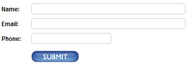
Lastly lets change the submit button to an image. We can do this via HTML or CSS. If your form uses GET as its method than you want to use the CSS option or it will append submit button x and y values to the query string.
Input Button as image using HTML
Replace the submit button HTML with the following code:
<input type="image" name="submit" src="submit_button.jpg" width="97" height="26">
Input Button as image using CSS
Add the following to your CSS document. You will also need to make the value of your submit button blank so no text appears
HTML:
<input name="submit" type="button" value="" />
CSS:
#form4 input[type=button] {
    margin-top:5px;
    margin-left:60px;
    border:none;
    width:97px;
    height:27px;
    background-color:#FFF;
    background-image:url(submit_button.jpg);
    background-repeat:no-repeat;
}
The finished result!
 This is just the basics. Get creative and use some gradients and other effects to jazz it up even more. Try www.css3generator.com if your not familiar with CSS3.
